
Hyundai Canada
improving the online car buying journey with a mobile-first redesign


Hyundai Canada • February - May 2025 • UX Designer
Hyundai Canada is transitioning from Sitecore to Adobe Experience Manager (AEM) as part of a tech stack upgrade, allowing for more scalable, flexible, and modern content management moving forward. They decided to use this opportunity to improve the site's user experience along the way.
Kick-off
The Hyundai Canada team provided us with a list of pages in order of priority. We kicked off the project by conducting a thorough audit of
-
the Hyundai Canada site,
-
other Hyundai sites across the globe, like USA, Korea, and Australia, and
-
competitor automotive sites
We synthesized patterns, pain points & opportunities, and best practices for each page or feature.
As we audited and analyzed the pages, we sized them in order to plan for the next 16 weeks.

Design process
Below is a simplification of the design process we followed. Due to the amount of work, there was a lot of overlap: sometimes we'd be doing analysis for one page, designing for a second page, and working on documentation for a third page.
Notes:
-
Not included are the challenges, changes, adaptations, confusion, pauses, loops, OOOs, and things that fell out of scope.
-
Book a test drive was sized as an S, so some pages were more or less complex than this
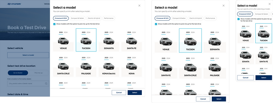
Book a Test Drive

Final designs
A little slice of where we landed!
Book a Test Drive screens


Vehicle Cards

Looking forward
This project is ongoing, so I can't speak toward outcomes quite yet.
This project was a very fast-paced, even for consulting work. We only had 4 meetings with the client per feature/page, so we made sure to use every minute to glean the most information.
As per usual, I wish we could have done more research to inform our designs and user testing to push our solutions forward BUT! no project is perfect and I'm still very happy with the outcome.